Like many others in the fall of 2014, I was swept up in the joy of watching virtual cats gather in my virtual yard when Japanese mobile game studio Hit-Point Co. released Neko Atsume. Three years later, the studio came back to release Tabi Kaeru. Unlike Neko Atsume, Tabi Kaeru was never translated into English. Despite this, there are still loyal fans in English speaking countries trying their best to enjoy this adorable game about a little frog who goes out traveling. Some fans get through the game by taking screenshots and using machine translation engines to understand menu options, and others have uploaded how-to guides on YouTube.
I’d like to reward these devoted fans for their hard work and loyalty by bringing the traveling frog to English-speaking countries. Although localizing the entire game into English is beyond the scope of my current capabilities, I wanted to begin exploring the idea by localizing the game’s banner image and developing a style guide.
This work is proof of concept only, and is not representative of Hit-Point Co.

Process
Step 1: Covering Japanese Text and Recreating the Background
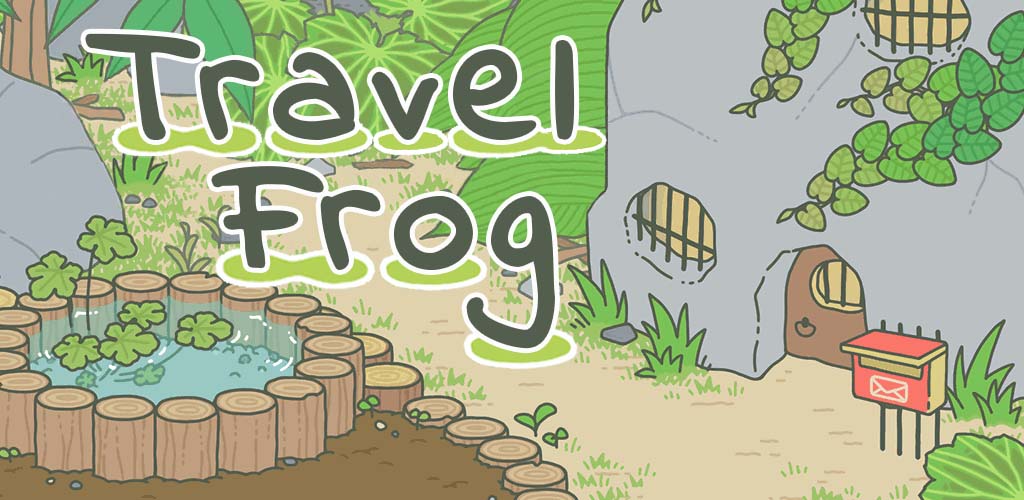
The original banner image has Japanese text that covers a background with several different objects, colors, patterns, and textures. The text also covers large blocks of the background. This made it very challenging to remove the text, as I had to entirely recreate the background and make my work blend seamlessly into the rest of the image.

I began at the rightmost character, る. I had first assumed that the leaf would be easy to recreate, as it looked like solid colors. Upon closer inspection, I discovered that the leaf actually had a very slight gradient between the darker green veins. When using the brush tool failed, I tried the clone stamp tool. However, this also failed as it was too difficult to create a natural looking pattern and successfully preserve the gradient and texture of the original art. Finally, I settled on my technique. I began copy and pasting other areas of the image. I placed each copied section over what I wanted to blend, then erased extraneous material, manipulated the new element to fit, and did slight blending with the brush tool to refine it. Piece by piece, I extrapolated what I thought the background would look like, and built the missing elements. This step alone was about 80% of the work for the project.

Step 2: Lily Pad Creation
Now that the bulk of the work was done, I recreated the lily pads that accented the Japanese text so I could use them when I inserted my English text. I found the easiest way to do this was to copy the front half of an existing lily pad, then merge the copy, then blend to cover any remaining parts of the Japanese characters. To get the shape as natural looking as possible, I also used the distort feature to subtly tweak the curvature on some of the pads. I saved several of these lily pad shapes as separate layers so I could move them around or change them freely.
Step 3: Inserting English Text
When I first began this project, I had explored some English font options for the text in the game. However, the text on the banner image was a more artistic font, and different from anything else used in the game, so I had to start searching for a font again. No English font I found was to exactly mimic the curvy, slanted, slightly disconnected look of the original font. I settled on Indie Flower, designed by Kimberly Geswein. It had the bubbly, playful look I wanted, but was far too thin. I remedied this by adding a stroke in the same color as the text to thicken the font. I also added a white stroke along the outside of the text to replicate the original look of the Japanese version.
There was obviously quite a bit of text expansion in changing 旅かえる to “Travel Frog.” I had to decide how to accommodate the difference in text length in my placement. Although the original text was only on one line, I wanted to keep a similar size font, so I split the English text into two lines. I also decided to offset the bottom line of text to fit it between elements of the background image. I kept referring back to the original image to make decisions on text tracking, size, and placement.

The last step of text insertion was to add in the lily pad accents. There was a lily pad under every character in the original version, so I would have to have a lily pad under every letter in mine as well. To do that without making the image look overly crowded, I used a combination of singular lily pads in different sizes and merged lily pads. An amusing challenge that I hadn’t thought about running into was the conundrum of the lowercase “g.” Does the lily pad go under the circle of the letter to stay even with the rest of the lily pads, or on the bottom of the letter like the other letters? I crowdsourced some opinions and went with putting the lily pad below the descending tail of the g.
Style Guide
Because my interest was not only in the flat-image localization of the banner image, but also examining how the game as a whole could be localized, I started developing a style guide. I used sample screen captures from the game to make a color key, establish typography, and begin a glossary. Then, I consulted Andovar Academy’s Translator’s Style Guide to decide what categories were relevant to this project. Once these core elements were in the style guide, I went back to the app to look for areas that I thought would need more intensive localization. I explored features like the help center, as well as game elements like the lottery or inventory items that had cultural context that may be confusing to a non-Japanese audience. I also consulted some App Store Optimization (ASO) agencies like App Store Radar and Gummicube to explore how to make the app successful on foreign app store markets.
My last step was to test my style guide by localizing sample images from the game. I was pleased with the end result, and thought that it accurately represented the original design and tone of the game. I have included those sample images here.


The full style guide is available for download. It is not an official document and does not represent Hit-Point Co.’s intentions for their app.
Final Image
Project Summary