Background
Companies often recycle advertisement styles depending on where an ad is being used and for what audience. After all, if you come up with a good design, why throw it out and create a new one if you could just tweak it? This process is known as “transcreation.”
This project started off as a transcreation proof of concept created by a fellow Translation student and me. We found a JPG of a Kellogg’s ad that was used in Venezuela during the Copa América soccer championship, which took place in Chile in 2015.
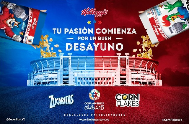
This ad features the stadium where the championship was held as well as the Latin American versions of all the logos (and, of course, the logo pertaining to that year’s Copa América). The stars at the top middle are from the Venezuelan flag, and the blue and red foreground represents Chile’s national colors. The cereal boxes feature Kellogg’s characters wearing Argentinian and Chilean soccer jerseys (the two participants in the final round of the championship), and they are holding Copa América trophies. The main text literally translates to “Your passion starts with a good breakfast.” As you can see, there is Spanish all over the place and plenty of little details to localize.
Research Phase
We started off researching for what sort of event Kellogg’s may want to transcreate this ad. We landed on the Super Bowl because of Kellogg’s’ sponsorship of many sporting events, such as:
- Copa América
- Major League Soccer
- US Olympic and Paralympic Teams
- American Major League Baseball
- Canadian National Hockey League
- Australian National Women’s Football League
Because Kellogg’s had a commercial in Super Bowl LII, we thought they would likely want to have ads for the next Super Bowl as well, so we decided to use the teams from this year’s Super Bowl as an example for what next year’s print ad could look like.
Brainstorming
We spotted some potential problems for transcreating this ad right away and came up with the following solutions:
- National pride will need to change to team pride.
- Americans do not usually talk about their “passion” for a specific team, so we’ll need a similar but not literal translation for a US audience (We ultimately came up with “Start your Sunday morning with a Super Bowl of cereal.”).
- Copa América 2015 logo will need to change to the Super Bowl LII logo.
- Venezuelan stars will be changed to team logos (Patriots and Eagles).
- Background color will be changed to team colors.
- Images, graphics, names of cereals, Twitter accounts, and web address will need to be localized.
So, with that, the concept was ready, and it was time to start creating!
Creation
Getting Started
While the concept was made with a Translation classmate, the Photoshop work was 100% up to me (because that’s what happens when only one of you is specializing in Localization Management). Taking into account all our ideas, I started off by getting my assets:
- Stock photos of: storm clouds, American football yard lines, and the US Bank Stadium
- Transparent logos
- Similar fonts
- American Kellogg’s Twitter accounts and website
- Transparent trophy
- Cut out cereal boxes and pouring cereal, separately, from original ad
Then, I tried to keep a similar composition to the original ad and placed the pieces where they needed to go. After much snipping and tweaking, they ended up where I wanted them. I decided to keep the cereal boxes and the falling cereal as separate layers so I would have more flexibility regarding where the cereal would end up in relation to the stadium. I then changed the colors of the characters’ jerseys using the paintbrush tool and the “hue” layer overlay option, switched out the trophies (and filled in some background color), and changed the logos on the boxes.
Next came the colored overlay. I took some creative license and made the colors be on the opposite sides of their corresponding team logos so that it wouldn’t be totally dark blue on one side and totally teal on the other. I added all the translations and localized logos, Twitter accounts, and website, and voilà:
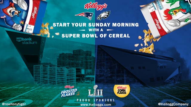
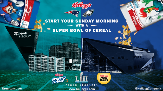
The low resolution is thanks to my brilliant idea to keep my PSD about the same size as the original JPG. Later on, this did not fly with my perfectionism.
Detail Work
To get the stadium to be a similar style and texture as the original took a great deal of effort and many more hours than I expected. In the end, I ended up doing the following:
- changed the layer to black-and-white
- heightened the contrast and brightness of the layer
- duplicated the layer and applied a rough texture
- lowered the opacity of the duplicated layer to 35%
- made a color-range selection of all light gray to white parts of the image
- painstakingly edited the details of the selection until it was exactly how I wanted it
- made sure to leave color where there would be shadows to make the stadium more three-dimensional (see original ad)
- switched to the color layer
- erased the contents of the selection from the color layer to reveal the white underneath
- continued to erase parts of the colored layer until I was happy with the result
The final touch to the project was adding “Official Cereal” to the cereal boxes, which is written on a curve via the “Warp Text…” option. I then rasterized the text and played with the size until it was about the same resolution as the cereal boxes.
Resolution Problems
After staring at this image for awhile and realizing I would be sharing it on a huge screen in front of an auditorium of people, I started to rethink the low resolution and image size.
Since there was nothing I could do about the quality of the cereal boxes and the stock photo of the stadium, I decided to leave the background a lower resolution and heighten the resolution of the foreground. This was when I realized, I HAD FORGOTTEN TO SAVE MY ASSETS TO MY COMPUTER. I had, instead, merely copied the images from my internet sources. Cue: smoke coming out of my ears.
After a process of re-Google image searching the logos, I was able to double the image size in Photoshop and re-add the higher-quality logos. Once I finished tweaking a couple more pixel-sized details, boom:
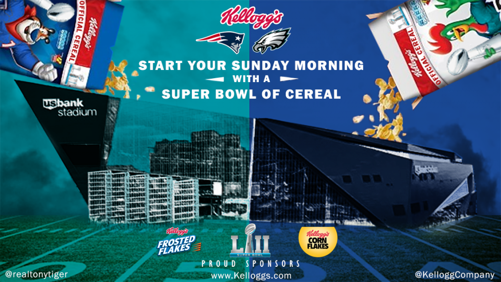
The masterpiece was complete.