In this project, I localized an arcade video game poster for the game Ongeki Bright, made by SEGA. This poster was taken from their website for arcade operators. There were three versions of the poster, one with the release date for the game, one with the dates blanked out so arcade operators can fill in their own date, and one that said “running with favorable reviews”, or in more simpler terms, “out now”. They all were in PDF format, and were A3 size.

I planned to import a PDF into Photoshop and create three text layers with the differing text. If I were to deliver the project, I would have 1 PSD with all the text editable and 3 PDFs with different text that corresponded to the three versions on the website. I downloaded the last one, as it had a yellow stroke around the pink text near the bottom, and I knew I would have to sample that color later.
The first hurdle
I opened the PDF, and tried to edit it, as I wanted to get some info about the text used in parts of the image. Turns out that wasn’t possible, as the PDF was password protected.

There were a couple of workarounds, however. The online converter that Adobe provides works for some reason, and I used it to convert the PDF into an image. However, the image size was much lower than that of the PDF. I tried using Photoshop and waifu2x to upscale the image, but both methods either distorted the image or added noise.

In the end, I found an online tool that removes passwords from PDFs. All I will say about this tool is use at your own discretion, for obvious reasons.
Getting to work
Now that I had the PDF in Photoshop, I started cleaning and replacing the text. I created a copy of the background layer, and started with the websites and links in the bottom right of the image. These were easy enough, as they were solid colors and the text flowed horizontally. Finding replacement fonts was not too hard of a job as well.

I wasn’t sure whether the copyright text on the bottom left would need localizing, but I made it editable just in case. This was the same with the trademark symbol in the middle right of the logo, in the middle of the text.

Problems arise
Next was the text in the bottom middle. The solid-colored background and text was easy to replace, but a small problem arose while adding the yellow stroke in the third version of the text. The layer styles in Photoshop could only create curved strokes around text, while the outline in the source PDF clearly was pointy. There were ways to add pointy strokes in Photoshop, but they all involved sacrificing the editability of the text. I worked around this by creating a second layer of the same text and converting that to shapes, but I imagine that the best practice would be to add the text in Illustrator. This stroke problem came up later while adding the text in the logo as well, which had a pointy white stroke around the characters.

After resolving the stroke problem, I moved on to the small blurb on the left, which advertised one free song for new “Aime”s, a small card that saves player data. The Aime logo is seen here, which I cut out and put into a new layer. I could then move it to wherever I needed it, which was important as it might move depending on how the text flowed. The text had some solid colors, but the “1 song free” text had a gradient. This wasn’t too hard to replicate, but the text expanded during translation, and flowed onto a second line, expanding the gradient as well. After half an hour of fruitless work trying to adjust the gradient to fit two lines, I decided to split the text into two layers. Perhaps there’s a way to do it that I missed, either in Photoshop or in Illustrator. Either way, I was done with this part and I moved on.


Help from the AI
The tagline on the top left was next. I used the brighten tool to remove the “foggy” effect around the characters, which I suspect is some kind of hue or shadow. Next, I spent some time testing out multiple ways to redraw the parts covered by the text, all of which didn’t work. I decided to try out content-aware fill for the heck of it, and it worked better than I imagined. I was able to replace the entire tagline with content-aware fill. While it needed some tweaking and didn’t always work perfectly, whatever it did screw up was trivial to fix.
Replicating the text and effect with layer styles was trivial as well, but positioning the text was not. It’s clear that this image was not designed with horizontal text in mind, and it wasn’t possible to split such a short sentence into two lines without feeling awkward. I opted to resize the text and put it further up so that it wouldn’t block too much of the image.


The final boss
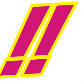
Finally, it was time to tackle the logo and its jagged shapes. This proved incredibly complicated to redraw. Content-aware fill helped fill some minor gaps, such as the horizontal line in the center, and it also helped give me something to work with while redrawing, but most of the colored shapes still had to be redrawn by myself. Replacing the text was easy, as it was just slanted text with a gradient and a pointy stroke, which I covered how I replicated earlier in this post.
A point of interest here is the headphones, which are the two dots in the ゲ character. I put it into a new layer and left it there as a stylistic choice, but perhaps it could see some use in some other language.
I opted to replace only the top part of the logo and leave the bottom text intact, as it was English. I left the Japanese text at the bottom of the logo as a stylistic choice, as Japanese logos of earlier versions of the game also had an English title on the bottom. I imagine the text wouldn’t be too hard to remove if needed though.


Lessons learned
I think I learned a lot about Photoshop through this project, both it’s strengths and weaknesses. This program was more lacking in text editing options than I anticipated, but I didn’t switch over to Illustrator while adding text because there were image elements in the text that needed to be tweaked as well. In hindsight, perhaps the images in question could be replicated in Illustrator as well.
I am also now convinced that the content-aware fill function operates on some kind of black magic. It saved me countless hours of work, and I don’t know where I would be without it. Content-aware fill sort of reminds me of machine translation. They both aren’t perfect, and aren’t replacing human work anytime soon, but they significantly speed up the process when used correctly and that makes them powerful tools in their own right.
