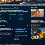
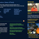
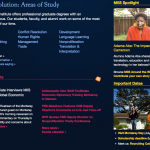
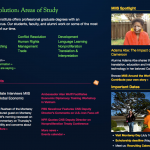
Based on the feedback I received in the previous post, I have created a second set of potential new color schemes for miis.edu. This is a combination of mockups that people liked in round 1 and a few additional mockups that people specifically requested. The light green has been completely omitted. It looks like the leaf green, Middlebury blue, sun, and raspberry shades are well-liked. Most people don’t seem to have strong feelings one way or the other regarding the new altered shade of lavender.
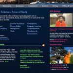
Here’s how these colors might look when put in context:


Please post your feedback in the comments.
If your comment doesn’t seem to go through, don’t fret — the comment is likely awaiting my approval. To be sure your comment is posted instantly, log into the blogging community before posting your comment.

I vote against all the options that include raspberry
I vote against having more than three colors for text on a single page (including the nagivation panel text).