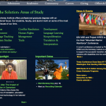
Alright folks, I think we’re getting closer. Here are a few color schemes displayed in our new homepage layout. Let me know what you think.
I know some of you really like the raspberry color from the previous mockups. It hasn’t gone away entirely — the raspberry will be used on the inside pages where it can be displayed on a white background instead of the dark blue background of the homepage.


I vote for Homepage 3
I like homepage 1 mock-up. Glad to see the red gone. I like the three different colors. I also like having a different color for the video section below the themes. When it is the same color it gets more muddled.
My thoughts:
— The versions that have the left side of the page all in green or all in blue lose any visual differentiation between the upper and lower sections; to the average fast-moving web-surfer, on first glance it appears to be one big confusing section. I think we need three text colors plus white to keep the information on the page visually organized.
— My favorite of these options so far is #4, though I am not sold yet on the goldenrod. What if in that area we used the lavender from earlier mock-ups? (This would actually turn this into #5 from your original set of mockups, but with the section positions reconfigured as they are today.)
Thanks Kristen!! I think I like #1 the best followed by #4. When Amy had the idea of the spotlight as a continuation of the be the solution area, I really liked the idea of just two colors but I think that since they layout now has Important Dates down there as well, it looks a little funny with two colors. If we were to go with two colors – I like #3 far above the rest – something about that “sunset” color… ; ) Just my two cents!
I like #1.
As much as I am still skeptical of the goldenrod, I could live with #4. By contrast, #1 just doesn’t work for me. I think that’s true for two reasons:
— I prefer not to feature the gold by having it show up “above the fold” on the page.
— The idea of having news headlines about things like bio-terrorism show up in a very “sunny” color seems at best odd, and at worst inappropriate. The News & Events section is typically going to have a pretty serious tone and I think blue would be a better fit.
I prefer #4 myself since in that iteration, the yellow “sun” color is used pretty sparingly.