

Me and a team of students worked on a small project to localize an English language game into Chinese and Japanese.
The game is called Top-Down Racing Car and is created in C#. It’s a simple game in which users control a car with their keyboard right and left keys to avoid hitting other cars. Depending how long they avoid obstacles, they are awarded bronze, silver, or gold medal.
Our team divided our work into two groups: visual design and engineering. I focused on visual design, performing desktop publishing work on text embedded in images.
Ideally games shouldn’t have any text embedded in images to begin with as it makes localization (or game modifications in general) much more difficult. Unfortunately, though, a lot of games still use this, especially for fancy texts custom fonts.
I completed two versions of DTP to demonstrate different versions of localization. In the first round, into Simplified Chinese, I tried to imitate the source as closely as possible. I pulled the images into Photoshop, masked over the original text with black rectangles that matched the background, and added new text in Chinese in a similar-ish font to the original. To match the text effects of the original, I followed two approaches. For bronze and silver, I added a border and gradients and used the eyedropper tool to imitate the exact gradient colors of the original. For gold, I used two different offset copies of the text in gold and white.


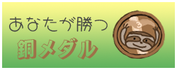


I did need to make some tweaks to the original design to accommodate Chinese. Chinese characters like “赢” (win) are really detailed. To make sure the text was readable, I increased character size and decreased the border size around the text. To maintain the rhythm of the original, the grammar was changed from “You win / Bronze” to “You have been awarded / Bronze”
The best part about these effect settings is that they still allow the text to be entirely editable. I could add ten more languages easily and would only need to make minimal changes to accommodate text expansion or character detail.
Good localization, though, isn’t always about imitating the source as closely as possible. Different locales need different things! Our team decided to take a more creative approach to Japanese localization and created new graphics. Our visual design head, Ruby, decided on a color scheme and designed custom cars and medals, and I followed these design guidelines to create new “you win” notifications. I added colorful gradient backgrounds and used custom fonts from Google.
An issue we were fortunate not to have in this game is driving direction. The US and China drive on the right side of the road, but Japan drives on the left. Luckily enough, this game was designed from the beginning with all the cars moving in the same direction, so it can work in either locale. Something the original creators didn’t do well, though, is that they embedded the word “ambulance” into a car. Instead of translating this for every language, I just scrubbed the text entirely.
When these visual assets were done, they were added to the game by our engineering team, who also implemented a globe button that creates a language pop-up menu. In the menu, users can change their language settings quickly and easily.
My takeaway from this project is that it’s a lot easier to internationalize from the very beginning. It would have been a real headache to change the car direction. I spent a lot of time re-creating assets in Photoshop that could have been saved if the text wasn’t embedded or at the very least if I had the original Photoshop files. I also enjoyed practicing creative localization by making fun visuals for the Japanese interface.