Description of project
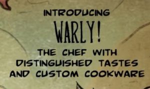
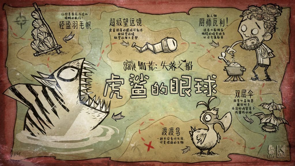
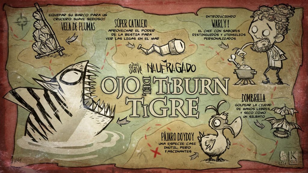
For the final showcase project for the Multilingual DTP course, I chose to localize a poster of Indie game Don’t Starve. The original file is a jpg picture with English texts (see below), and I decided to localize it into Chinese and Spanish, respectively representing CJK languages and European languages.
 The workflow
- Text preparation. As I didn’t have the .psd file with separate text layers, the first thing I did after I got the source picture was to type everything that needs to be translated into an excel file. I chose to use excel because most of the sentences are lacking subject, verbs or punctuation signs. Putting them in word or .txt might confuse the CAT tools.
- Finding the right fonts. Find font websites are really useful in looking for matching fonts in European languages, but it doesn’t work for CJK languages. I find the same fonts in the poster on these websites, and I resorted to font preview databases in Chinese for Chinese fonts. After choosing the right fonts, I downloaded them and store them in the font folder for use.
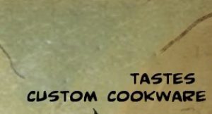
- Masking: Hiding the original texts is an inevitable step for every Photoshop DTP project without pdf source files. As the background of the poster has really complicated colors and a lot of textures, I chose to use patch tool to remove the texts. Content awareness also works sometimes, but as for the drawings of coastlines in the background, content awareness can’t figure out the consistency of it. (see below before and after removing the texts)
- Replacing the texts with translated ones. This also includes testing the pre-chosen fonts and matching font size, leading, kerning, as well as font width.
- Work on the title.
 Figuring out the basic design of the title is the first step. The title looks complicated but in essence, it’s in bold font, light yellow color with the black stroke. After figuring that out, it is not difficult to imitate the effect in layer styles. The texture is the second thing I worked on. There is a subtle wood texture inside the words of the title. To achieve the same effect, I selected the pattern with the marquee tool, went to edit – define the pattern, and saved it as a pattern. Then I used the pattern stamp tool to paint the texture onto the words.
To paint on a text layer, I had to rasterize it or create a new layer on top of it. A small tip in painting patterns is holding ctrl and click on the layer, Photoshop will automatically turn everything on the layer into a selection. Then you can paint the patterns inside the selection and don’t have to worry about getting the pattern everywhere. - Review. After I was done with the texts, I zoomed out the poster into its original size and looked at the overall effect of it. While I was doing the Spanish version, I found that the words are too crowded, so I adjusted the font size and leading to make it look better. (see below for the final products)
Small tips for Photoshop DTP projects
- Copy the background layer (the source .jpg layer) before start working on anything and keep it locked. Only work on the copied layer. Then if anything goes wrong, you won’t ruin the original picture.
- Ctrl/command + Z is always your best friend when you do something you don’t like, or accidentally ruined the whole thing. History window also does the same thing. You can always go back to the step that goes wrong by simply clicking on that step shown in this window. You can go to windows – show/hide history to open the history window. Keep in mind that the history can only hold limited steps, it is sometimes impossible if you want to go way back.
- Organized and clearly named layers are extremely helpful in boosting efficiency, especially when you are dealing with a large and complicated project. Keeping Layers in groups are also very helpful.
- Use different websites to find fonts. There is not only one find font website out there, and they don’t share the same database. If you fail to find the perfect font on one website, try other ones: they might even have free fonts.
- The final review is necessary. It is important to double check the details like typos, it is more so to look at the poster as a whole when it’s done. The overall layout is extremely important in most Photoshop products, especially in posters.

Leave a Reply
You must be logged in to post a comment.