During my earlier assignments for my Website Localization class, I ran into some frustrations when trying to implement webfonts. My language is Japanese. It’s not an uncommon one by any means, but there’s extremely few options nonetheless! Even Google doesn’t have any Japanese web fonts (it does have some in beta, however, and I’m looking forward to those being fully launched).
The problem of CJK Fonts
So why is it that there’s so few options? Japanese, like Chinese and Korean, has thousands of characters. Japanese people learn some 2,000+ in school, but there are another thousand or so necessary for proper names – and if you include all the rare characters, you end up with more than 50,000! That means that if you are using a font other than the pre-installed ones, you are forcing your readers’ browsers to download thousands of files, which makes the page slow to load and increases the bandwidth usage enormously. What’s more, that’s just for Japanese – Chinese is even worse, in terms of the number of characters needed.
All of that means that the majority of websites in CJK languages don’t use custom fonts. That leaves you with only about two options – sans serif or serif (also known as Gothic and Mincho, respectively, for Japanese). The exact font differs on one’s browser, however – Apple uses Higarino, while Windows has Meiryo, etc.
All of that is why, when my classmate mentioned wanting to do CJK webfonts for our final project, I jumped at the chance. I like fonts! I think a nice, clean, unique font can make a simple website beautiful. It’s too bad that almost all websites can only use the same old boring Mincho and Gothic, and I wanted to learn how to play around with something more exciting.
Typekit
Our initial research led us to Adobe’s Typekit. Typekit is a host of webfonts, similar to Google fonts. I had never been able to get the beta Google font to work with my website, so I was glad to see that Typekit’s Japanese fonts are fully supported – and implementing it was easy!
The way Typekit works is that you build a “kit” of fonts that you can then install in your website. You tell Typekit the domain of the website you are building, and then Typekit gives you a bit of code, which you can put into your website’s html to connect it to Typekit.
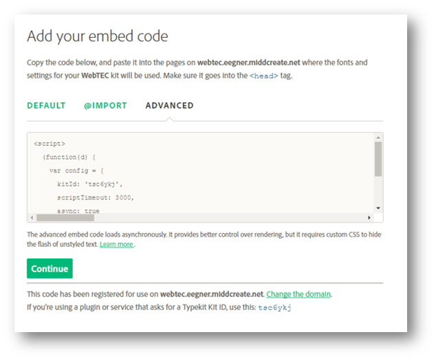
I recommend using the Advanced embed code – it lets you do some of the more exciting stuff like asynchronous loading and font events that I will discuss below. Just copy this code and put it into the head of your site’s html.
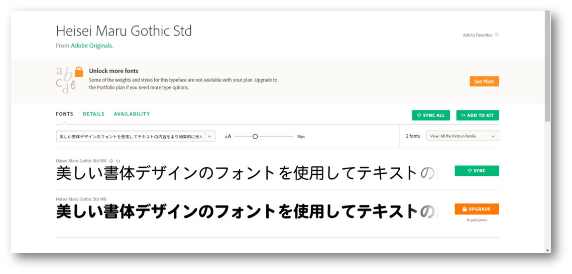
This is the font we decided to use. There are only a few free Japanese fonts, and most of them are pretty similar to the in-browser existing fonts. We chose Heisei Maru because it’s rounded look was the most unique of all of the options, so it would be easy to tell in our test website whether or not the Typekit font was working, or whether it was the default. We chose the Chinese and Korean fonts for similar reasons – the default font was sans serif, so we chose a serif font for our Kit.
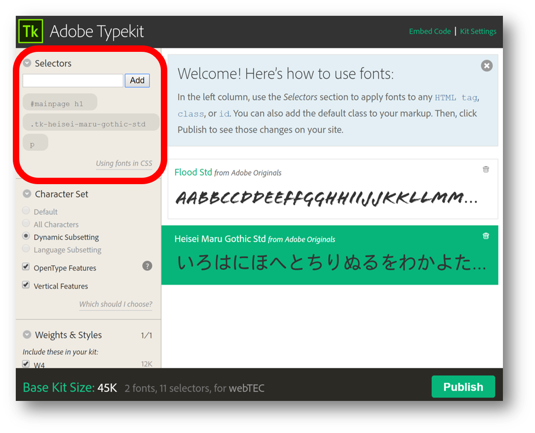
The next step is to tell Typekit where you want that font to show up. You can use html tags like p and h1, or even classes and ids. That said, I couldn’t seem to get most of the options to work. It is also possible to add fonts to specific locations by using font-family in your CSS, but to be honest I couldn’t seem to get that to work either…
But that’s it! Just a few steps, and you’ve got Typekit ready to go.
What Typekit lets you do
Asynchronous Loading
Since we used the advanced embed code (you did use the advanced code, right?), asynchronous loading is available by default. If you use the default code, your browser will load the JavaScript first, then access your Kit and load the fonts. But there’s really no reason for that – you don’t need to wait for your JavaScript to load for the fonts to work. So the advanced code will load the fonts and JavaScript asynchronously.
To be honest, I don’t really understand what that means, but what I do understand is that without asynchronous loading, you won’t be able to access the other benefits of Typekit: using font events and dynamic subsetting.
Font Events
Font events are, well, events with fonts. Basically, embedding font event code, as indicated in the picture below, tells your browser to treat fonts differently depending on what’s happening. So, when the page is loading, you can choose to use one font. When it’s finished loading, you can use a different one.
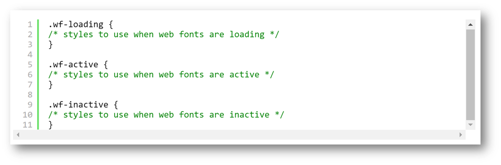
The main benefit of using font events is that .wf-loading bit. One of the drawbacks of Typekit is that it loads the words on a page before it loads the font. That means that you have a split second where the page shows the browser’s default font, before Typekit kicks in. So you get an ugly, incredibly unprofessional “flash” where the fonts are changing.
We wanted to get rid of that, so we edited the CSS to take advantage of font events. Simply by adding “visibility: hidden” to the wf-loading code, and “visibility: visible” to the wf-active code, we can hide the text until the browser has connected to Typekit. Then you have everything load at once, which looks much cleaner and more professional.
Dynamic Subsetting
The enabling of dynamic subsetting is the primary reason someone would want to use Typekit. I can’t emphasize how important it is, especially when it comes to CJK languages. Let me reiterate:
Always Use Dynamic Subsetting!
So, what is dynamic subsetting? This goes back to the point I made above, about the main reason that CJK languages have so few fonts available. Basically, the fonts are too big. The benefit of dynamic subsetting is that Typekit scans the page, determines which characters are being used, and then loads only the necessary characters that appear on the page. Instead of needing to download thousands and thousands of characters, the page will only have to load a couple hundred. That’s immensely beneficial, both in terms of time and bandwidth.

The good news is that Typekit is smart – it automatically defaults to using dynamic subsetting with Japanese fonts. In the example screenshot, it is actually the only option allowed, because the font in question is Japanese. However, it’s not that smart, because for some reason it treats Japanese differently from Chinese and Korean. Makers of Chinese or Korean websites will have to manually check the dynamic subsetting button.
(As a side note, it’s pretty cool that Typekit also allows vertical type, as seen in the same screenshot. Hard to do on a website, but could be fun to play with!)
Limitations
We used Typekit on a very small, simple website. That worked fine, but I can easily see how it would get buggy the bigger and more complex the website is.
For one thing, the fact that you have to put the code in the header of the html means that you have to put it in the header of each and every page of your website. This could get really annoying really fast. Maybe there is a way around this – maybe some plugin in WordPress could let you edit the overall html for your entire website? – but I don’t know how.
Secondly, because you need to tell Typekit the domain to use, it doesn’t seem possible to use it in a text editor like Brackets that lets you test code. That got annoying for us.
Finally, we ran into limitations caused by the fact that we were using a free account. First of all, the free account only has a very few fonts available. Secondly, the Kit only allows you to create two fonts – which was an issue when we wanted to use fonts for four different languages (English, Japanese, Chinese, and Korean.)
We did get around that by just making two free accounts with two fonts each, but that gave us a different problem. One of the Kits would load, but not the other. What’s more, it was a toss-up which would load – you could see the Japanese and English fonts, then (without editing the code in the slightest) refresh the page, when the Chinese and Korean would work.
However, the issues with the free account are, of course, easily fixable. I can anticipate Typekit being very useful for running a small, fairly static website, such as for a small business, as it would only cost about $50 a year for a basic paid account. And I loved that I could get some more unique fonts going without much trouble at all!
Credits
Here is the post my colleague Tim Saar wrote on the same subject.
And here is the post by my colleague Chelsea Inaba.

Leave a Reply
You must be logged in to post a comment.