I am a huge fan of Japanese TV shows, and I actually first stumbled upon the word “localization” when looking up more about fansubbing J-dramas; the resulting research on the topic I did at the time actually led me to where I am now, in a MA translation & localization graduate program at Middlebury Institute of International Studies at Monterey. I think it’s a shame that J-dramas don’t see much love here in America (where most of the attention is given to anime or K-dramas), and my desire to see more Japanese TV localized overseas inspired me to undertake this little project. I found posters for two J-dramas that aired in early 2021 and localized them into English in Photoshop. Details on the workflow processes for each can be found below!
Note: This project is a proof-of-concept only and does NOT represent Yomiuri Telecasting Corporation or TBS Television.

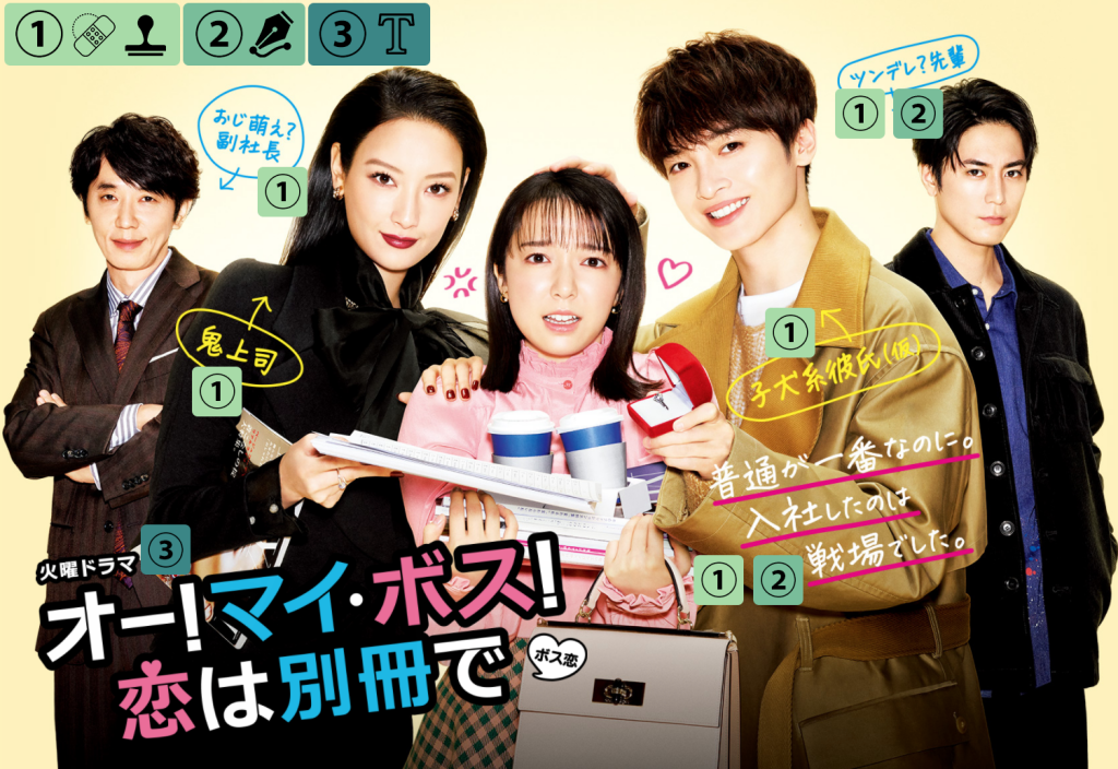
Oh! My Boss! Poster Workflow
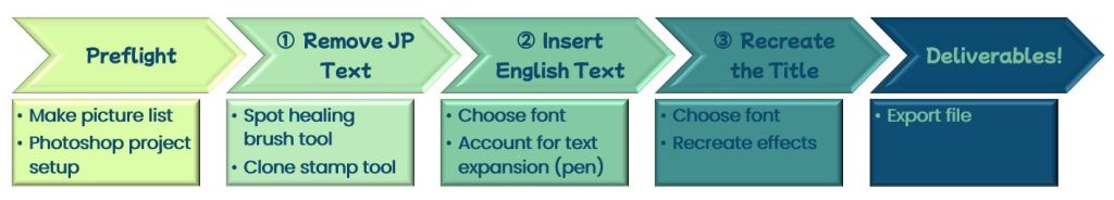
Preflight
My first step was to create a picture list in Excel for the translatable text so that I could have it ready for later. The tone of all of the Japanese text is quite playful, so I did my best to replicate that in my English translations. Perhaps the most noteworthy line here is puppy-like boyfriend(?), which came from the Japanese 子犬系彼氏(仮). This set of characters does roughly have the words for “puppy-like” and “boyfriend”, but the last kanji in parentheses literally means “temporary” and hints at some of the romance drama that plays out throughout the series between that character and the main character in the middle of the poster. Boyfriend(?) was my way of toying with this idea and keeping the playful register of the poster.
Setup of the Photoshop project was also important. I was actually very lucky, as I also had a version of the poster without the big title text in the bottom left corner, making Step 1 of removing the Japanese text a bit easier. In Photoshop, I placed the title-less poster in a layer above the original and above that created a new empty layer called “paint over” where I would do all my painting over the Japanese text work as part of Step 1 so I could always refer back to the unedited poster layers.

Step 1: Removing the Japanese Text
I started out by using the Spot Healing Brush (set to Content-Aware) on all the Japanese text. This worked quite well if the text was over a mostly solid background (i.e. the blue text bubbles at the top), but for the other text that had a more complicated background behind it, the result left something to be desired.

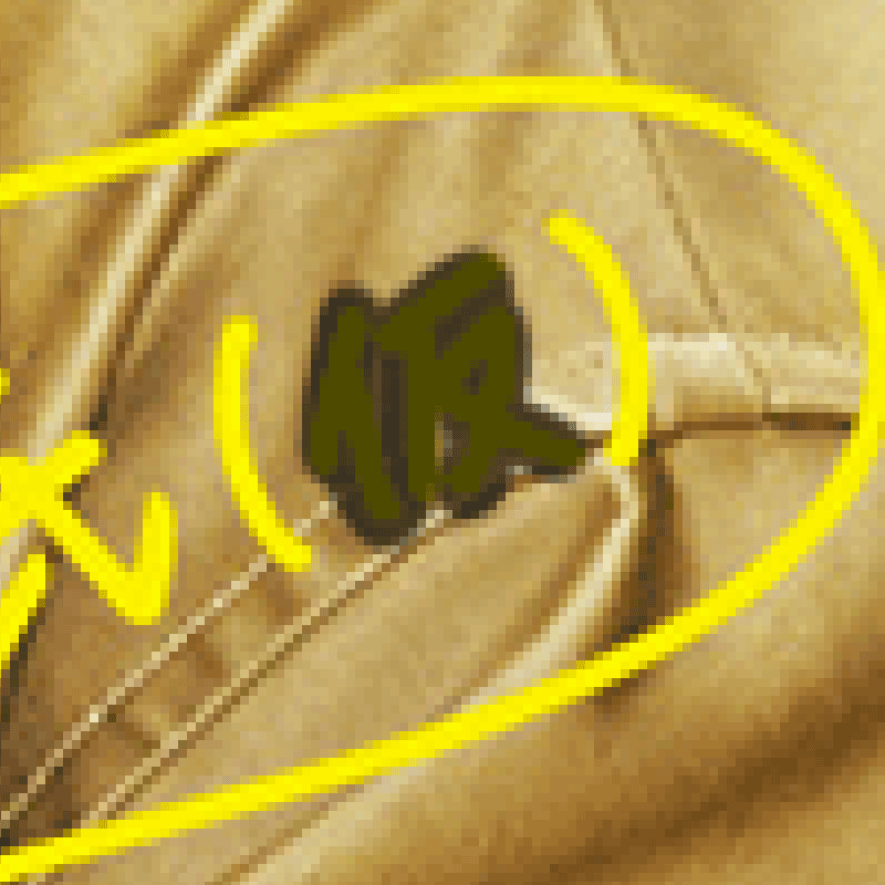
This required a fair bit of work to make it look acceptable. I spent quite a lot of time with the Clone Stamp Tool (and accompanying it with the Spot Healing Brush) in order to paste over textures and fix it up. Here’s a small example of how I used clone stamping to repair part of the jacket lace – I essentially tediously did this a bunch of times to fill in the affected parts.
It paid off, though, since the final result on the jacket looked pretty nice in my opinion!
Step 2: Inserting the English Text
Next, I pasted in English translations from my picture list, and I chose an appropriately playful English font that I thought worked pretty well. Ideally, all the text would be the exact same length as the Japanese and fit perfectly within the text bubbles (or over the three purple lines on the jacket arm), but unfortunately, this was simply not feasible for a couple of places, and I had to get creative with my solutions.
Redrawing the text bubble
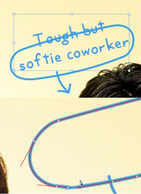
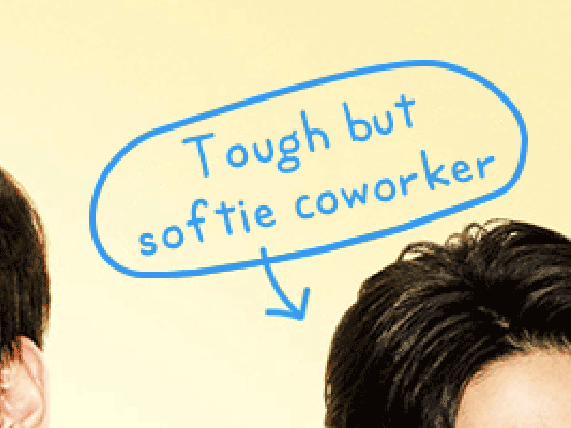
In Japanese, the blue text bubble in the top-right has two words: ツンデレ “tsundere” (a character who is initially cold on the outside, but slowly starts showing a warmer/softer side) and 先輩 “senpai” (someone older than you in school, a workplace, etc). Both words as is are understood by a lot of people who have watched Japanese media, but if this is going to be a true localization, they need to be translated. Unfortunately, there is no single English word that captures the essence of “tsundere”. I went with “tough but softie coworker” to be playful while getting across the hot/cold concept, but the length of it added a line to the text which caused it not to fit anymore (and changing the font size only gets you so far since keep in mind it can’t be too different from the font size of all the other text). Sure, I could’ve changed things entirely and gone with a shorter English phrase that meant something completely different, but that would be taking the easy way out!
What I ended up doing was redrawing the blue bubble to be bigger to accommodate the extra text. I erased the original blue bubble with the spot healing brush, then experimented with the pen tool and was able to recreate the outline fairly well. Just like in Illustrator, you can use anchor points to draw curves with the pen, and fortunately here it didn’t need to be overly precise because the original wasn’t a perfect ellipse.
Worked out pretty well in the end!
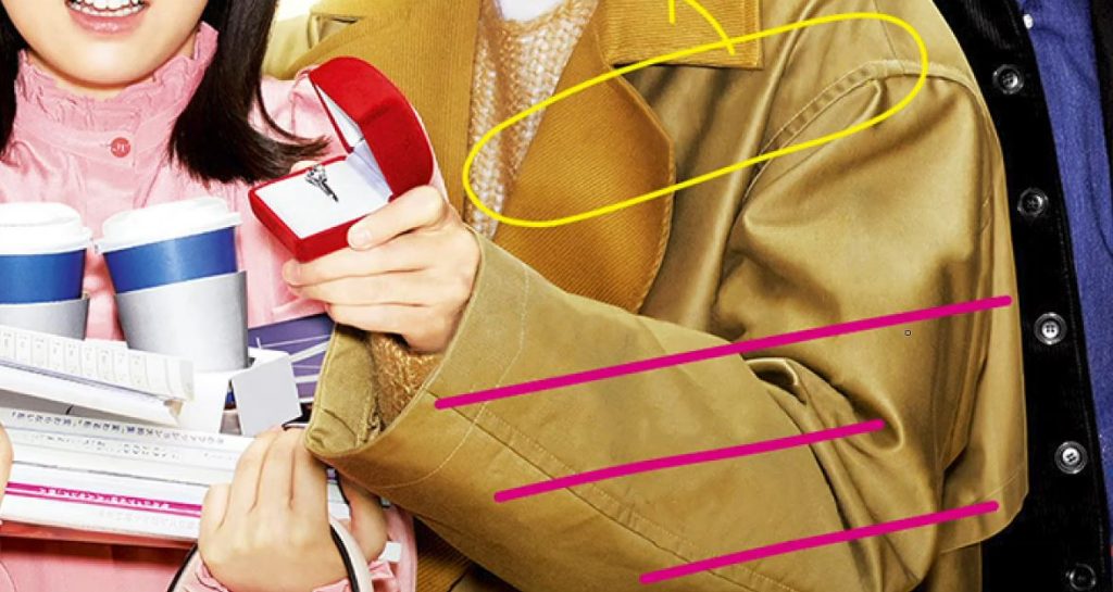
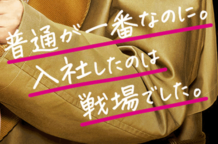
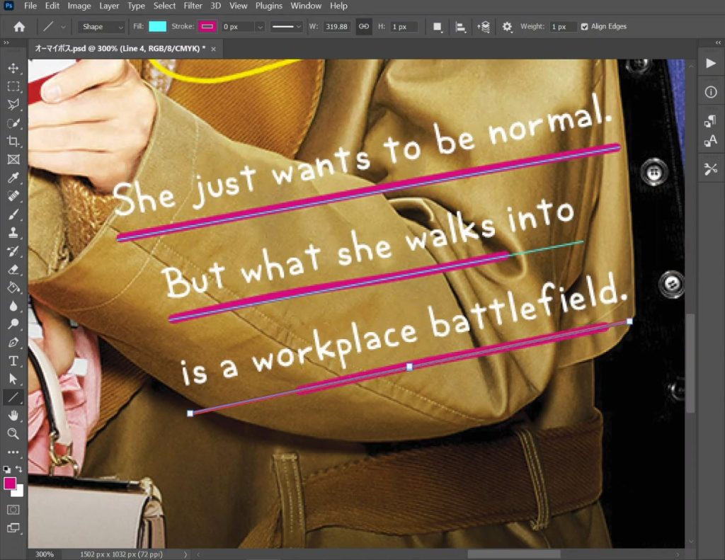
Extending the underlines
When I saw the three purple lines underlining the original Japanese text, I knew that I’d either have to come up with an English translation that was the perfect length on all three lines, or I’d need to do some redrawing. I tried for the former and was able to a) make a translation that was three lines long in English, and b) fiddle with the segmentation enough to get the first English line to exactly match the length of the first purple line, but of course it was impossible to get all three to line up – the second and third purple lines needed to be slightly extended to accommodate the extra text.
I again was able to use the pen tool to solve the issue. Making the lines 7 pixels matched the thickness of the original, but one thing I noticed was that the original lines weren’t perfectly straight (since this art is supposed to be mimicking hand-drawn lines), so I couldn’t just slap single straight lines on there and call it finished. I ended up using 1 pixel guides (unfortunately, there is currently no way to add angled guides in Photoshop, so I actually added them manually with the Line Tool) to give me a rough guide of where to draw, and then I redrew the lines with just the tiniest bit of curvature throughout. Another advantage to the pen tool was that you could make the ends of the lines capped, an effect that almost perfectly replicated how the original lines were drawn.

Step 3: Recreating the Title
The final part of this poster to localize was the title. To find a suitable font, I first started out by simply browsing through the available fonts I had to see which one looked “nice”, but I quickly realized I needed a better way to narrow things down. Since the drama itself takes place in a magazine publishing company and the title’s font reflects this, I looked up a list of magazine fonts and picked a few to try out. I colored the words the appropriate colors and added a thick stroke to mimic the original in each font to see how the text looked, and you can see a comparison of several of them below:
My brief personal thoughts on each:
- Arial: Looked okay, but a bit too curved/smooth for me.
- Vayu Sans: Didn’t really capture the right feel for me and felt a little narrow.
- Inter: Captured the magazine “mood” the best (to me at least) and is what I ended up going with in the end.
And a couple of final notes:
- I changed the “o” in “Love” to a heart to mimic how the Japanese had a heart at the top of the character for love (恋), which actually was supported by most of the fonts I played around with. The only exception was Vayu Sans, where I had to paste it from a different font.
- The original title logo also had a small speech bubble on the bottom right, which says ボス恋, an abbreviation of the entire title. Abbreviating is something that’s done much more in Japanese, most commonly by taking parts of two different words and fusing them together (similar to how we say “sci-fi” for science fiction in English), and this is especially prevalent for drama titles and other media works, where the abbreviation is often what’s used as the hashtag term when the show is referred to on sites like Twitter. Unfortunately, this isn’t something that really can be applied to the English – perhaps I could’ve forced something like OMB for “Oh My Boss”, but the connotation of the abbreviation just isn’t the same in English – so I decided to leave it out.
Generating the Deliverable!
Finally, I did some last checks on everything and made some small adjustments to the positions of some text, then exported the image in the same file format (.PNG) and as a similar file size. Check out the comparison below, where you can drag the cursor to switch between the original Japanese poster and my localized English version!

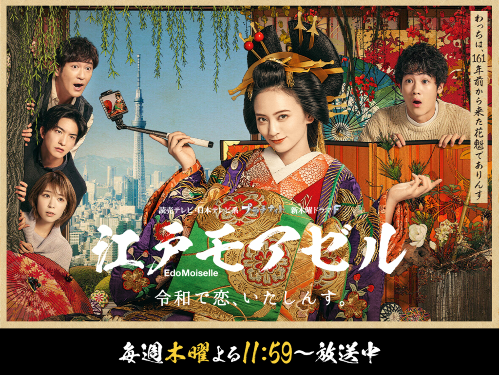
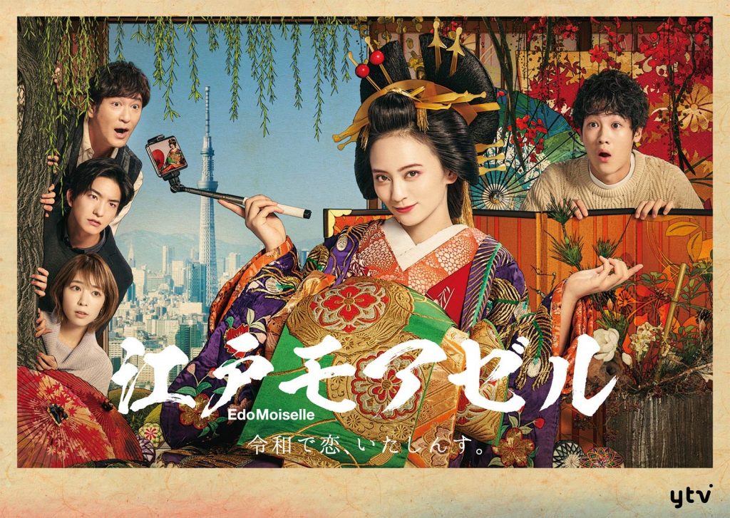
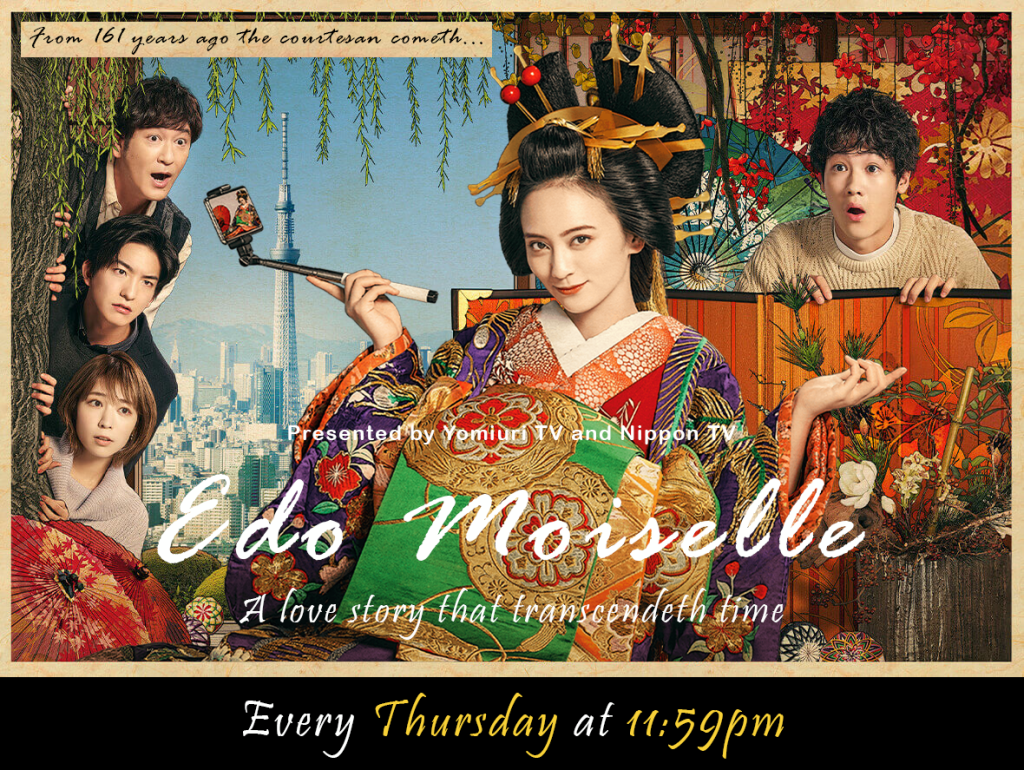
Edo Moiselle Poster Workflow
This poster was significantly easier. Why? Well, for the Oh! My Boss! poster, I had a version without the title in the bottom left, right? For this poster, I had different versions of it missing nearly all the text, making things much simpler. The reason I chose this particular drama was because it was my fansubbing project in early 2021 and the thing that eventually led me to commit to going to a graduate program in localization, so I wanted to give this one last whirl of English localization as a cherry on top to the passion I’d poured into the fansubbing I’d done for it earlier in the year.

Preflight
First, I made a picture list for the translatable text. The last line corresponds to the small text right above the main title in the middle, where I simplified it by cutting out unimportant info about the specific drama slot (roughly translating to “Platinum Night, New Thursday Drama F”) for the TV networks that produced the drama, which would’ve merely been confusing/distracting had I put that into English.

A translation choice I made was incorporating some Early Modern English verb inflections to reflect the antiquated Japanese in a couple of the lines (they’re written as if a courtesan from 1800s Japan said them). This was something I put a lot of extra effort into for my fansubbing efforts, but I’ll spare most of the linguistic details (you can read more about that here if you’re interested). I will note that I did change row 4 (and row 3 to an extent) slightly, where the original Japanese was written in first person, but since Early Modern English verbs don’t inflect in first person, I switched the English to third person to make an environment where using “cometh” would be grammatically correct.
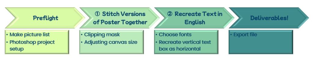
Step 1: Stitch Together Different Versions of the Poster
Here were the two versions of the poster I had:
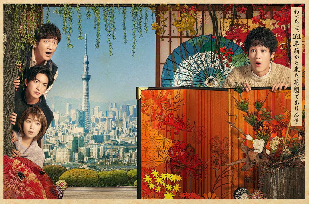
Neither of them had ALL of the text gone, but the left lacked the vertical text box and the right had none of the other text (and is missing the main character, who I conveniently had as another image).
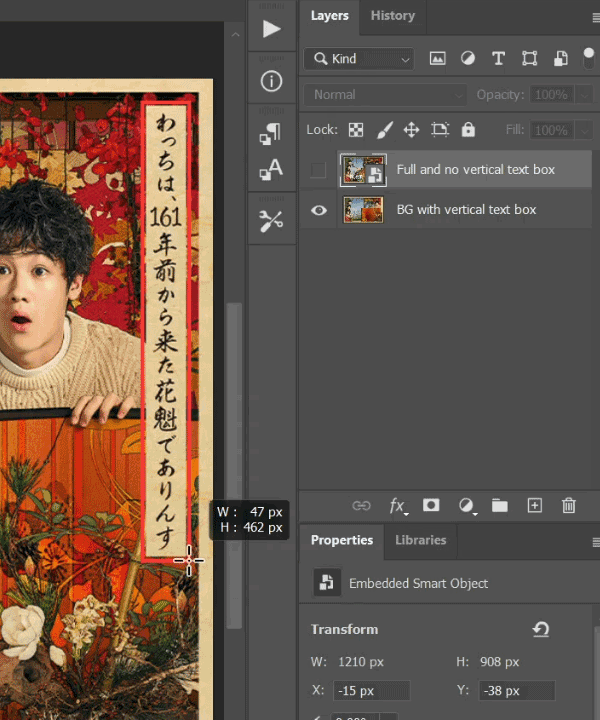
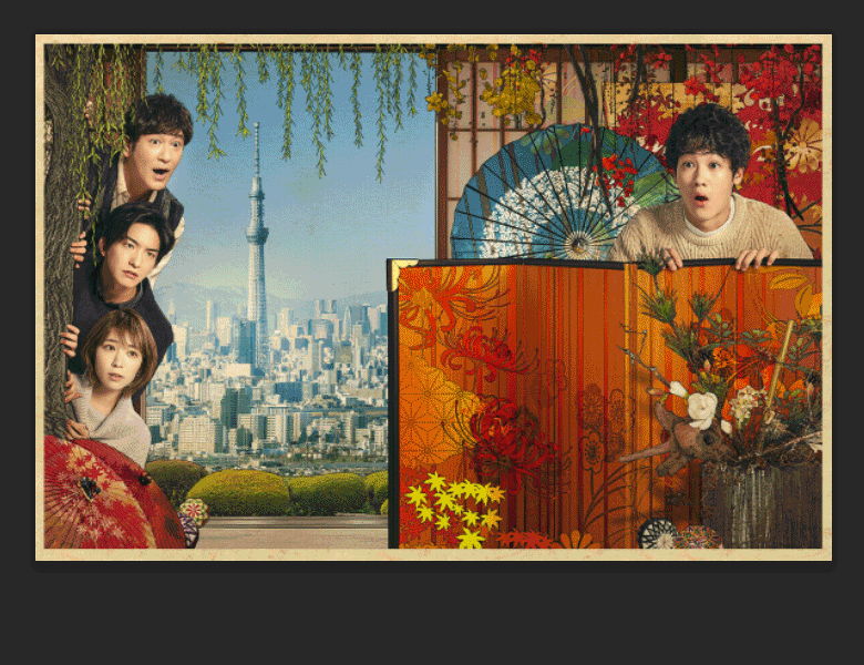
I used the right poster version as a background but defined a rectangular area around the vertical text box with the rectangle tool to create a clipping mask in order to have the corresponding part of the text box-less version show through, thus getting me a background image where all Japanese text was erased. I then expanded the canvas size and filled the space in with black to match the original poster asset, and finally I placed the main character back in.
Step 2: Recreate Text in English
Adding back in the English text didn’t pose too much of a challenge, with the biggest thing to consider being font choice. For the main title, the Japanese font had a calligraphy vibe that I wanted to replicate. I found a few different fonts that I compared for all the different text, which you can see below:

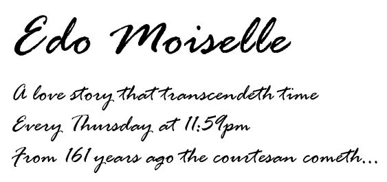
I decided that for the title, the second font replicated the feel the best, as it felt appropriately old-fashioned.
For all the other text minus what was in the vertical text box, I decided on the first font because it still had an old-fashioned mood to it but had the plus of being more readable, which was important given the font size was much smaller than that of the title, and things such as the time the drama airs at needed to be easily readable from far away.
For the vertical text box formerly in the top-right of the poster, it wasn’t as important that it be readable from a distance, so I ended up going with the second font again. As the background color of the text box had a scroll-like texture, this worked perfectly in tandem with the font in creating a Declaration of Independence kind of vibe of quill writing on parchment.
Speaking of, that vertical text box was recreated horizontally for the English, right? The way I made it was by taking advantage of the fact that one of the versions of the poster I started out with had extra space at the bottom with that exact parchment texture. So, I merely wrote out the text on that, then used the Rectangular Marquee Tool to cut out the section to paste at the top of the poster:

Generating the Deliverable
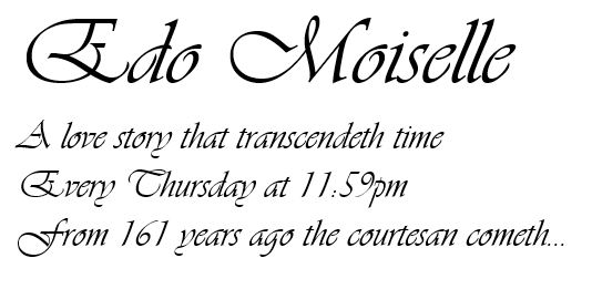
When I was preparing to export the poster, I found myself still a little unsatisfied at the title text. It wasn’t quite thick enough (and attempting to add a stroke to the text worked quite poorly) and I didn’t feel the calligraphy vibe that I did in the original Japanese. However, when I was on a trip to the grocery store that day, I actually came across a font on the wall of the store that I felt was perfect for replicating the brush style of the Japanese – I’d been there probably a hundred times but never noticed it until then!
So, inspired by this new revelation that suitable brush fonts for English exist, I looked up and found a very similar font to what I’d seen in the store to apply to the poster as a final touch, then exported the image from Photoshop as a PNG. Check out the comparison to the original Japanese poster by dragging the cursor on the photo below to switch between the two versions.

Thank you very much for reading about this project, and I hope you enjoyed my work!!